Thursday, December 5, 2013

Christmas and the Effect on Political Cartoons

The Christmas season is coming up soon and the effect it has on political cartoons is very interesting. While the Christmas season is full of cheer and good spirits, it seems like the opposite occurs within the realm of cartoons. The Christmas season seems to take out the worst in us, even though it's supposed to be when we are supposed to be at our best. 
Charlie Brown is a beloved character who makes his appearance during almost every holiday, even the minor ones. Here Charlie Brown and his little christmas tree have been turned into a political message. His tree is labeled as the health care reform, and the ornament holding the tree down is labeled as compromise. It shows here that Obama does not compromise (referring to the text) about his reforms, and it seems to ruin the spirit of the holiday. Using a beloved character seems to relay the message much more effectively, because you know who they are talking about and how the cartoon actually portrays the message because you know the story associated with it. Using black and white instead of color also enforces it. Charlie Brown is a semi depressed character living in a life which is bright and colorful, where he always learns a lesson and what's most important in life. Showing this image in black and white could decrease the ability for Charlie Brown to learn from this situation and cause him to lack in his ability to continue in the happiness of his life. This can push him back into his depressed self with no way out, even though in all the Charlie Brown cartoons he finds a way. The snow fall in the background shows how peaceful the rest of the world is while this is occurring, and how it seems to only affect those who are paying attention. 
This image discusses the political correctness of our society, and how we all seem to have to be politically correct when interacting with each other. Here, even at the presence of the baby Jesus and his family, the 3 men (not the wise men due to the text below the image) cannot seem to give a proper greeting to the man whom the season of Christmas is named after. This is showing that our society feels the need to be too politically correct, and how potentially it could be a social downfall. Even though we are all different, and celebrate different aspects of the holiday, we should be able to understand that and give each other the greeting we wish and not feel as though we can't say Christmas. I feel as though this image portrays this message effectively using the image of the Holy Family, even if one isn't a believer in Christ. This just shows that no matter the individual, everyone worries about being politically correct in situations.
As the Christmas season approaches there will be more and more interactions within political cartoons and different messages that need to be expressed. Using the holiday of Christmas will bring about many different viewpoints on beliefs and cause disagreement during the happiest time of the year. The images which will continue to arise will be extremely interesting, especially with all the recent political news. 

Wake Up, America!

I found this image while searching for political art. I found it extremely interesting and immediately wanted to discuss it for multiple reasons. They are so many different references within this image, that it brings across such a deeper meaning to the piece. 
The obvious image in the front is the statue of liberty, which is drawn into a real beautiful woman. Her face is soft and lips are red, though I personally feel as though her hair should have been black for the image she is trying to portray. Here she is referencing Snow White, with her pale skin and red lips through her deep sleep. Here she is sleeping while America is plummeting into chaos. Within the fairytale of Snow White there are many hidden meanings. Analyzing fairytales brings these meanings to life, and understanding them is extremely important for this women. 
Snow White is put into sleep because she is not ready to be a women. Her sleep symbolizes the part of her maturity where she starts her period and is on her way to becoming a woman. The queen doesn't want her to be a woman, because she will take over the kingdom and become a mature woman and fully be fairer than her. She is put to sleep through a period because she isn't ready to take on this role as a woman, and really needs to sleep to mature because she is not ready. 
The meaning of this image is clear once the analysis of the fairytale is understood, however the artist goes much deeper than that. The red background and the red of the elephant which she is holding seem to relate back to the Snow White fairytale, which is so heavily incorporated into this image. Lady Liberty is asleep while our country is seemingly going through it's own maturity, however in this image the maturity seems to be demise. The country is failing, such as Snow White failed to become a woman at the right time and was sent into a sleep and how the queen wanted her asleep so she could not become a woman, Lady Liberty is being held back as well. Through the demise of the country, she is also not ready to actually go in the right direction. It seems to show that the country needs to fall before she awakens and can build it back up. 
The crosses in the background can also deal with the idea of Snow White's innocence. She doesn't understand death because she has not matured. This might show that Lady Liberty's sleep is partially of her own doing like Snow White's. Snow needed to mature, and Lady Liberty seems to not want to deal with the issues at hand. That is why America is asleep, they are not noticing what is happening. They cannot mature and understand what is going on. 
The stuffed animal held in her sleeping arms is an elephant, representing the Republican party. The innocence of Snow White is shown through the stuffed animal in her arms, but also the innocence of the country. Our country hasn't matured enough to fully understand as a whole what is going on. That is what the image is portraying. 
Using fairytales is an extremely interesting way to incorporate political ideas. While it is unusual, and hard to understand without understanding the analysis of the tales, the idea comes across extremely easily. Even if the analysis isn't understood, the text brings the message across. Fairytales are extremely interesting to me, and I love to analyze them. Finding a political image which can be analyzed using a fairytale was extremely interesting and effective for the message.

Thanksgiving

Political artists have been using the recent thanksgiving in order to promote images and use them towards relaying messages. These messages are portrayed through humor as well as simplistic messages. Using thanksgiving as a theme seems to reach to a wider audience, because almost everyone celebrates thanksgiving. It is a holiday for giving thanks and loving family, but is that always the case?
This image shows the family giving thanks and counting their blessings. Each person on the table is giving thanks in different ways; facebook, twitter, texts, etc. The words rhyme as the audience reads across the writing, which also enforces the meaning of the image. The older generation state that the modern technology cannot enforce the message of thanksgiving, which is very important for the image. Since these electronics keep us from the true meaning of the holiday. The image is shown with a family sitting around a home cooked meal on the table, each one of them except the older generation on some sort of electronic, showing the gap in technology with their age as well. The tones within the image are earthy, which also could reinforce the meaning of thanksgiving and giving blessings for all we have. The image is simply drawn, however there are details given to each figure. While this could make the image hard to relate to, it actually makes it easier to relate to. Because with a family being portrayed, that's all that's important to get the message across. 
This image relates Obamacare to an uncooked turkey, which has yet to thaw and yet is about to be cooked. The frozen turkey isn't prepared, but it's trying to be served to the people who came to thanksgiving, which could represent the country in general. This image simplifies Obama while giving him his significant features in order to ensure who he is. His expression is nervous, and he doesn't want the audience to know that he is lying. The turkey obviously needs more than a little time, and while it is de-thawing it is no where near complete. Incorporating the recent debate and enactment of Obamacare, and while it doesn't work, using the images within this cartoon is helpful when portraying the message. 
This cartoon uses color to portray its message. The chef, who is portrayed to represent Obama, is serving a shiny silver platter which looks as though it contains a big mean (labeled promises) when in actuality what is given is just a white bone (labeled reality) which is absolutely nothing than expected. Uncle Sam is the man who is being served. He has a disappointed expression on his face, which is easy to read even with the simplicity of the cartoon. It's also interesting that the wine glass looks as though there isn't actually wine in it, there is only water. Not serving wine in a wine glass also brings the message further forward, even though it is such a simple, small detail. This image seems to portray that there have been so many promises, but they have been left empty because while there is reality, really it isn't much. 
Using holidays within political cartoon allows for a new and different way to portray a message. These holidays happen every year, which makes using them as a theme even more interesting because they can be related to so many different modern circumstances. Every year something different happens politically, and using holidays that occur every year allows for a larger audience to be reached because the majority of them celebrate these holidays. 

Visual Image from the Affordable Care Act

Obamacare has brought about a shift in the healthcare system as well as creating a lot of tension between the political parties. Political cartoonists have started to incorporate this into their cartoons, incorporating different meanings and different viewpoints of this system. It's become a primary focus in a lot of political arguments, and whether or not there is agreement with the policy there are interesting images which come from this plan. This image to the right is the Obamacare symbol, which was found through google, which is visually interesting on its own. Obama's new logo is featured at the bottom with an image looking like the medical symbol is on top of it. This here shows that both of these images are working together for the people, through the colors and the background it shows that they are working through America. All the people in the backgrounded are whited out and don't have faces, showing that anyone could be one of those people and that are behind this system. This image is open and suggests that so many people are behind the Affordable Care Act, even if this isn't the case for everyone. The insignia is centered within the image as well, giving a balance within the image. 
This second image is a political cartoon about Obamacare, which is much more simplistic in how it relays the message. The image of health is created through the use of a syringe, a common tool within the medical field. It is extended to shoot through the entire body of the individual within the image. This individual used is Uncle Sam, who represents America and is used in many different political images. The use of red white and blue in this image also represents America, though the white background creates a different visual field. Having the white background makes the image of Uncle Sam pop. The meaning of the image seems to show Obamacare shooting through Uncle Sam's body, and causing it to bleed. If Uncle Sam represents America, than it is saying that Obamacare becomes a wound in America, makes it bleed.
This is a second political cartoon which I found about Obamacare. This image is of an older woman holding a pill bottle which represents Obamacare. This image works like a commercial for medicine, where the medicine is the focus and it looks all bright and cheerful. However at the bottom of these adds there is small letters which show the side effects of the medicine, which here shows the side effects of Obamacare. The colors in this image are dulled bright colors, with Obamacare bolded in red. The use of red makes the Obamacare look dangerous, since when relating to medicine the color red is not a positive thing. The added wording at the bottom of the image, added at a later date, also makes a pun on swallowing pills and relating it to America.
It was interesting searching for Obamacare comics or images, because there weren't very many positive ones. I think this is because political artists like to make fun of what is going on, and rarely support it. They like to expose every flaw in every system, and through doing this even the smallest of negativity becomes big, which makes political cartoons extremely successful. 

Thursday, October 31, 2013

Japanese Soft Power

Japan is such a unique country that I have always been interested in. The way that Japan uses it's soft power (a cultural exchange on international levels) is extremely interesting because there are so many ways in which they can do this. The most common way that affects young people such as myself is through anime, manga, video games, and the "kawaii" (meaning cute in Japanese) culture.
The soft power of Japan affects our culture in so many ways that it seems we don't even notice how much is actually there. I know so many young people that watch anime and they read manga constantly, loving every moment of it. The impact of video games is even greater, because the majority of these games with the cute little characters comes from Japan; Pokemon is one that people don't always realize comes from Japan. Such as the image to the left, how many people represent this little guy? A large majority of people seem to be able to remember "Pikachu" and know his name. His influence on my generation especially is amazing, and while it doesn't affect every person it does effect a large amount. Japan's influence on our country is amazing. But how does this play into politics? What political influence does this use of "soft power" seem to have?
Young artists use anime in order to incorporate politics into something entertaining. An anime which I have watched called Hetalia. This anime uses political and historical events in order to create a historical satire. Each of the characters personifies a country in a humorous way, and interact with each other as they move through history. The anime itself is deeply researched and seems to be extremely accurate, especially with the personifications of the characters. While this anime itself can be seen as a political outlet, especially with the characters, the artwork that I have found reflecting this anime is a better example of soft power. To the right is a cartoon drawn by a fan representing two of the countries of China and Japan. It by itself is a pure example of soft power because the comic is focused around that exactly. Visually it's laid out as a manga, with the panels and speech bubbles. The style of the artwork also represents the "manga" or "anime" style of work that we know and can easily recognize. The funny thing about this image is that it specifically relates to soft power, and that Japan is using their culture to manipulate china. I just thought it was ironic that I found an image that relates to a topic of discussion within the topic of this post.
The anime of Hetalia becomes the perfect example of soft power within anime because its entire purpose is to discuss history or politics in a humorous way. Though Japanese soft power goes beyond this one anime, there is so many different ways in which this occurs.
Visually, anime is quite appealing for many reasons. Even the anime that were made in America still seem to represent the Japanese manga style of artwork. The style of this artwork is easy to characterize. Usually the characters have quite large eyes, even when their eyes are smaller they are still quite large. The faces are simplified as well as the expressions on the face. They show the rang of emotion through simplicity, because the artists of anime and manga have to draw so much. They make things cute, the girls are thin and generally look cuter than the men (i.e. bigger eyes and larger feminine features) while the men look more masculine (in most cases). The characters themselves are different for different series, because they appeal to different audiences. The range in these series are the same as our genres, the style itself interests so many different appeals. The work to the left represents an anime (as well as a manga) series that I loved for so long, Fruits Basket. I felt as though it represented Japanese soft power personally because it was one of my favorite shows and what got me interested in Japanese culture. The girl in the front is small and cute, happy face with large eyes. She has soft pale skin (which in Japanese culture is idealized) and is the one holding the animals. The men in this show represent different types of men to appeal to many different girls (since this is a "girl" anime). Visually this image represents the idea of anime and manga well in my opinion, and I feel as though it helps in the representation of Japanese soft power. However they are many different examples of this, too many in fact it was hard to choose one.
I know personally, as stated previously, I was deeply affected by Japanese soft power, especially in the progress of my artwork. This is a drawing that I did in 2009, which seems like it was quite some time ago especially if you look at my studio work now. As an artist I feel as though I should be ashamed of this image, however it's something I did when I was interested in Japanese culture, and it was something I did early in my relationship with my current boyfriend of 5 years, which is something we can look back on and see what all I've made for him. I chose this image also because I thought it was funny that I chose to dress us in University of Kentucky clothing and I was still living in Indiana at the time. Here I chose to represent my relationship with my boyfriend using the manga style with the large eyes, bright colors and even my current hair color was affected by the anime style. This shows soft power well, because I incorporated it into my early artwork, though I have expanded far beyond that it was still a frequent factor in my early artwork. I have dropped the style and moved to realism, however I still occasionally draw using this style. This style just isn't practical for a studio art major, however I am proud that this is how I learned to draw early on.
The use of soft power that Japan brings to America is quite surprising because there is just so much, their culture intertwines with ours and we don't even seem to realize it. It's personally affected me, and I feel as though it'll continue to incorporate itself into the American culture.  

Monday, October 28, 2013

Just a Bill...?

I find it curious that I have found two different political visuals referencing the old School House Rock's video of "I'm Just a Bill", one as an image and one in the form of a video. This cute little rolled up document, tied with a red ribbon and a red, white, and blue button representing who he is, is an icon in a sense. Those who have grown up watching School House Rock or seeing these videos shown within the classroom, know who this little guy is, even I remember my parents showing me these videos and using them as a tool to help me learn. The original video can be found here: http://www.youtube.com/watch?v=tyeJ55o3El0

It's interesting that this little guy has become represented once again during Obama's presidency, and I feel as though the way in which bills are treated under Obama, since it seems as though his presidency has been a lot of bill passing. The first image that I found was while I was scrolling through the "humor" section on pintrest. I thought that was interesting since politics doesn't seem to play a big roll at all within that website. The image was taken from the original video where the bill and the boy are sitting on the stairs of capital hill talking about how a bill becomes a law, or how it works. The humor behind this image is represented using profanity and large bold letters. Apparently the bill here is stating that no one seems to know how a bill becomes a law anymore in this day and age, however I feel like it goes beyond just this presidency. Society itself seems to not be concerned with politics at all, and they seem to just let it happen without any sort of care. Though this image was taken from the video, the spot at which the video was stopped to take this image is extremely important when it comes to analyzing the visual impact of it. The bill looks hopeless in this image, as he wants to become a law. He sits there, waiting, exhausted from his journey. 
http://www.youtube.com/watch?v=hKhXxvT9iak : This video is a parody based on the little bill, discussing the health care reform. This video was made back in 2010, and yet it still used this school house imagery. While re-created in both visuals and words, the character remains the same. No matter what the intent of the video, taking the imagery from a classic video always brings our minds towards this video. It's interesting that the video purposed for education could be taken so many ways over, in a way to continue the education of the people. Since people seem to pay more attention to something that is a satire as opposed to something legitimately education, it's smart that parodies are created using an educational basis; especially since the target audience would be anyone who had watched these videos when they were young. Through this it can be understood why this imagery is important, as well as why the imagery continues.

Explosive Birth (Extra)

http://www.noupe.com/inspiration/50-stunning-political-artworks.html
This work of political graffiti art struck me. I couldn't find any information about this work, other than it was just an idea of the artist in order to portray a message. I feel as though this image could have multiple meanings behind it, through it's simplicity and design. The use of simple black and white has quite the impact, though the "whiteness" of the wall is not completely there. 
One meaning from this image which deeply saddened me was childhood bombers. I've heard stories from war veterans as well as from people who knew them about children who were handed grenade by military men of their countries to go and attack the American soldiers (and probably has affected other countries, however I've only heard of the American soldiers). These young children were forced to go bomb the American troops, causing the troops to be ordered to shoot. These children don't know what they are doing, they are innocent victims in this situation, which in turn causes such pain for these soldiers. In order to protect the troops they are forced to destroy these young children, which were born into these situations just by living in these areas. That meaning of this work of art is beyond saddening, because I know soldiers who have been forced to shoot children, and it deeply wounds the soldiers forever.
However, while that is the immediate meaning I receive from this image, there are also many other meanings which can be determined from this art. A pro-life message comes to mind as well, because of the relationship between these two small objects. The grenade in this image can represent the womb, but more importantly the mindset of a women in an unexpected pregnancy. Her body becomes a grenade, because depending who the woman is she could decide to terminate the pregnancy. The smallness of the child is highlighted here, because the baby fits perfectly inside the grenade. The size shows the figure of a baby, how we see one in the womb, and yet it's so tiny. That itself shows that this is a child, even inside the womb. This comes to my mind because of the amount of abortions have been compared to a genocide, to a war, and that also relates to my first immediate message.
Another message which I perceived from this work is the destruction of childhood. The grenade represents childhood as the child's life is attached to it, and it feeds from it. A child's innocence and their spirit of childhood is constantly attached to them, but it is fragile and could easily be destroyed. I think that this message could also represent that. 
The simplicity of this image could also bring multiple more meanings, however those are the two that I determine. Visually this image could take on any meaning, even ones not even pertaining to children. It's stencil like drawing allows for that. 

Tuesday, October 22, 2013

Halloween's Impact on Visual Politics

Halloween is closely approaching, and October in general seems to be focused entirely on Halloween itself. The holiday has been known for dressing up and scaring people, or the day where the spirits rise from the grave, even about candy in general with trick-or-treating. Since this holiday is coming near, I became interested in the visual impact of this holiday. 
www.cagle.com
 The image shown here I thought was extremely funny and obviously was a satire. The little old lady is passing out candy on Halloween, which are displayed with bright colors. The adorable little children are dressed up as clowns for their halloween costume, extending their bags for candy. The speech bubble represents the little old lady's voice, and she is stating that the children are dressed up like politicians. This is humorous because it's stating that basically the politicians within the government are clowns. Clowns themselves are often associated with humor, and with doing silly things. So by comparing a politician to a clown the image states that the government can't really do much other than be silly and acting foolish. With modern politics this could be the case, depending on who the viewer is. This image is obviously meant to be funny, and I feel as though it isn't representing any specific people within the government so the image itself can't cause offense to anyone in particular. The colors used within the image are bright and colorful, making the image pop and catch the eye of the viewer. The image is drawn in more detail, possibly to enhance the clowns and make them extra colorful, since that is also a generalization with clowns.
www.cagle.com
This second image has a different message entirely than the first, however it still has to deal with the idea of associating halloween with political cartoons. This image refers to global warming, and the fact that this fall is supposed to be extra cold and since there was a recent snowstorm. This reflects on the modern fear of global warming, and represents this through the creature of Frankenstein. Frankenstein is a modern character who is known for halloween and often represented in many children's costumes. He is a creature to be feared, because he is a monster. This associates global warming with a monster, even though it isn't a being. The little old lady seems to represent someone who is easily scared which could relate to the entire populace, since they are frightened by the idea of global warming. Also this brings in a bit of humor because the older generation are known and made fun of for enjoying watching the weather. The monster of global warming is intruding into her house and she chooses to ignore his supposed scariness by asking him to shut the door because it's cold. She's comfortable in her home, and wearing long clothing because it is colder weather. The bold red print of the "AAAAGH!" draws attention to the fact that the monster is supposed to be scary, though he is not.
Halloween has impacted these two different topics within the political world, the simple topic of politicians acting like clowns as well as global warming. This can show how a simple holiday can impact the political world. 

Government Shutdown

Early to mid October the government was in shutdown, and this created a deep impact on political cartoons. Both during and after the shutdown, cartoons have been popping up and either pushing blame or making fun of the situation. 
www.cagle.com

During the shut down the government closed all federally run programs, even if it cost little money to keep the programs running. Here is an image that shows the national parks being closed. The brown baggies are covering the faces of the presidents on the mountain. This shows that the images themselves aren't imporant. Although the faces on this monument are common knowledge, it seems as though covering their faces has a deeper meaning behind it. Not only does this government shutdown affect the people, it affects the government itself and those in the past who have run it. Government shutdown has happened before, and it seems as though this image could also state that the presidents of the past are hiding their faces because they are ashamed of what is happening. They are ashamed that the government cannot be run today, and that it did shut down. This imagery here can also be seen by the blank faces drawn on the bags, and the fact that the faces also look very fake and cartoony. However this imagery could also simply be because it happened in October and it was approaching Halloween, and could be making light of the situation. 
www.cagle.com
The second image here relates to the cause of the government shutdown: Obamacare. Which isn't entirely the reason it was shut down, however it is a cause for the Republican party. This cartoon seems to relate to how I feel about Obamacare, but more importantly pokes fun at our political figures. The image seems to reflect the historical triptych, which is three paneled imagery. The three different boxes reflect a different color, which seemingly does not reflect anything significant. If the yellow in this image was a reddish color it might reflect it more. However the purpose of this image is not to reflect on America, and it's not to forcefully bring attention, since it uses light colors. However the fact that his shirt does reflect red can bring the colors into it a little bit, however the yellow throws that off. The typed words in the image are bold, and are obviously the main meaning coming from this image. Simply put, if the people in power can't run the government, how can the people expect them to run a health care system. This image is directly related to Obamacare and the artist seems to be against it. This doesn't seem to be completely favoring either political party, since a lot of the blame of the shutdown was on the Republican party and that's addressed too. The simplicity of the image reflects the shutdown and the cause, showing that there is no trust within the government. 
www.cagle.com 
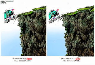
The third image was created once the government was reopened. This basically pokes fun at the government in general, and that it never functions. The car is falling off the cliff with an American flag, with an Obama bumper sticker on the front. The driver is hard for me to depict, however it seems to not matter because it generally could represent any individual within the government. The image shows that the government is continually falling off a cliff, and the shutdown did nothing to fix it. The message is strong, and shown very obviously here. The car here could either just represent the Obama administration in general, or just the government as a whole since Obama is currently the president, and represented by the bumper sticker on the car. The cliff could seemingly also represent the fiscal cliff, representing the increase in taxes and budget cuts in 2013 and the debt that Obama has created for the country. This image was created once the government was up again, and I think it's pretty funny because it basically says that the government doesn't do anything. This isn't true, however sometimes it might feel like it. 
www.cagle.com
This image was also created when the government was reopened and it's a very general image. It's message is portrayed through the writing on the sign, which is a sign commonly found on the front door of shops when they are opened. The word "open" is bold and in your face, white against red, making it known that the government was indeed open. However there is the general disclaimer at the bottom, which is very popular in our society, stating that this is only the case until there is another issue. The government is going to have plenty of issues throughout the next many years, and the fact that there is that general disclaimer is humorous. This image is satirical and most definitely represents the state of the government today. The government only works in harmony, and not with political disfunction, and that seems to be the message that this image is portraying. The American flag portrayed in the back simply represents America and also can play into representing the government.
The government shutdown has been a blessing, in a way, to political cartoon artists. As seen here there are many approaches to relaying the message, and the visual impact of these images is made known through it. 

Wednesday, September 18, 2013

Miley vs. Syria

Property of: ww.cagle.com/news/miley-cyrus/
While the topic of Syria has been something our country is struggling with, I find it very interesting that while this is a major event in history, the majority of the country is focusing on Miley Cyrus's performance at the VMA. While the country should be in hot debate over going to war in Syria, we seem to be more focused on our celebrities and the obscenities that happened at the VMA awards. Why does our country push away from the serious issues and focus on these trivial ones?
The political cartoon at to the left shows a young person playing on the computer looking at the top story in the news. Political cartoons have embraced the fact that America as a whole seems to be more concerned with Miley's performance and artists are incorporating it into cartoons and using it to kind of coincide with the crisis in Syria. The image itself is split in two, though unequally. The image on the top which is focusing on the crisis in Syria seems larger and has more of a dramatic impact, drawing the viewer in. The dramatics of the green gas fog engulfing the people while the people cannot escape seems to visually imply what is happening in the country. The representations of explosions and gas seem to incorporate the crisis of the country into a larger panel. This is contrary to the truth, which is actually what is represented in the bottom panel. The citizens over in America seem unconcerned with the crisis in another country, and the top story during this was Miley's performance. While the panel in the cartoon is smaller, showing how this story should actually be viewed, the character is wearing red which is bold compared to the rest of the cartoon. The red could also represent one of the colors of America, and just the fact that he is sitting at the computer unconcerned shows the emotion of the country about this.
Property of: www.cagle.com/news/miley-cyrus/
The image to the right is one that seems to affect more of the older generation, since they are the ones being portrayed in this comic. The older generation seems to be appalled by the fact that Miley's performance is what is causing this country such distress as opposed to the crisis. The slouched back positions sitting in front of a flatscreen in a comfortable chair shows the typical American people. This is how American's take in their entertainment from the television. But since these are older, they seem to have more of an interest in the world around them as opposed to the younger generation. The younger generation don't seem as though they take into any concern how different events could impact the country. Like the first cartoon the comfort of our people is shown, and the fact that we have technology that we can use all day long, as well as the lack of the impact the crisis in Syria took on us.
I find it very ingenious that political cartoons are reflecting on this issue, since it seems that young people only care about celebrities and their own lives. Taking into account the young people's interest in the media and how their lives seem to center around it, cartoonists are trying to either reach the young generation in an odd way or to mock them for their ways. It reflects the political mindset of my generation for a vast majority of the population. While these cartoons are satire, they do reflect the truth.


Monday, September 16, 2013

Visually Effective? (Extra)


The most important political issue to me is the Pro-Life movement. I believe that a person is given life at the moment of conception, because from that moment on they grow. In society today, abortion has become such a big issue. There have been severe debates on what constitutes abortion, and whether or not it should be a right, and this extends into the issue of birth control as well. While I believe this political issue is more of an ethical issue, in our current culture abortion becomes a topic of politics. 
Following a Pro-Life group on Facebook I see a lot of the arguments for our cause. But are these arguments effective? Each post is accompanied with an image, and whether or not these images are actually effective could be determined through analysis of these images. 
The image to my left is one that I believe is not very effective. The argument immediately creates negativity with any women who believe their body is their choice. It would cause the pro-choice people to not consider the argument, since it seems like any of their views are pushed away immediately. The image of the baby is poorly photoshopped, where the edges are harsh and it looks less like a baby in the womb. Editing a photo of the baby in the womb would cause less proof that the baby is alive and does deserve respect. Making this image un-realistic looking counteracts the argument, and through that there's nothing that would cause anyone to consider this position. While the wording is accurate, the image itself causes invalidity in the argument. A better way to portray this argument in my opinion would be the next image to the right. 
In this image it shows the baby in the womb, such as the first image, however the baby looks more realistic. Since this is actually a baby in the womb it creates a more effective argument. The color choice seems to compliment each other as well as creating a realistic outlook. It doesn't create negativity with the other side, it's simply asking as opposed to forcing a message. Stating that this isn't an argument, it's the truth doesn't force against either side. This shows that abortion is an issue of mortality and ethical rights other than an issue of political rights. Though the central argument of this issue is apparently political in our society. I believe this message is more effective than the first, not only at showing the truth but for protecting the rights of the other side. While they believe abortion is a right they have and a choice they should be able to make, this is more of an argument that makes one think as opposed to forcing them to choose one side over the other. 
These two different sides don't seem to give each other any "wiggle room" when it comes to the issue. One side believes that if abortion was illegal it would take their rights away as a woman, but that side doesn't seem to consider the life of the child in that situation. The other side believes that abortion should be illegal and that our society should focus on the right of the child, but they don't seem to take into consideration the emotional toll of some circumstances. As a pro-life person, I believe the right of the child is what we should focus on, because they are a living being. However I do believe that my side tends to use extremities when it comes to arguing and that the different ways they push the argument are not always effective. The most effective argument I've seen is this. 
This piece to the left is a work of art that I found browsing through Facebook in a memorial for the unborn children in 2010. This work is by Martin Hudacek from Slovakia. The piece is based off the lose of a child at age 15 to abortion. The speaker at this event spoke about how she believed she could bury the child's memory, but that it could not happen. Burying the child's memory instead ended up capturing her over many years, but that God performed a miracle and let her see the child and that is what the piece represents. This piece shows the struggle of actually having an abortion, and how it affects someone deep down. This image visually seems to give a deep impact. It reflects on someone's personal struggles as well as representing the pain of loosing a child and how it never goes away. I believe this piece is the most visually effective, but it takes an understanding of the image to see why.
This image might not seem like it would be as effective because it takes the understanding of the artwork to notice it, but the fact that the photo of this image is always followed by an explanation allows for the impact of the image to be successful. This is the only way to show an effective argument to both sides, to show the trauma of an abortion years later down the road. In order to change someone's beliefs, you must first get them to understand. There is no winning or loosing when it comes to different sides of an issue, there needs to be an understanding. For what I believe in, the image showing loss and pain I believe is the most visually affective image to promote this belief. 

Monday, September 2, 2013

What Politics is to Me

My name is Rachel Budzenski, but I go by Rei, it is a name that I have chosen for myself because I feel it suits me better. I am an undergraduate student studying art education and studio art with a minor in art history. Politics has always been something I am interested in, especially in modern society where my personal beliefs seem to conflict with a lot of politics but also seem to be what drives it.
As a young member of society I interact with politics every day. When I walk through campus and speak with other students I know that each and every one of them views politics differently. Whether liberal, conservative, or moderate in beliefs, there are many other factors that can play into each and every person's personal political beliefs. There are monetary factors, religious beliefs, personal experiences, or parental influences. Personally, I know that my religious beliefs play a very important role in how I view politics and my personal beliefs. I am very conservative in my beliefs, and am very open to expressing them. The main focus of my political beliefs is the fact that I am pro-life. I very heavily believe that life begins at conception, and that from that moment on a baby is a person. While this is the core of my conservative beliefs, I also allow for my religious beliefs to shape other issues. Politics becomes extremely important to me, because our culture doesn't focus on religion anymore. While religion is important on an individual basis, our culture seems to be backing away from allowing religion to impact our lives. Individually people in society are selfish, and only seem to focus on issues that impact them. But politics pulls away from that, because it forces individuals to at least vote on issues that go beyond them. That is what politics is for me, it is a way to express myself as well as a way to force society to think beyond themselves. Even though not everyone does this fully, at least they choose something. They can choose to not care, be a republican, democrat, moderate, but they could also not choose a side and focus on the issues. Not everyone chooses to keep up with modern issues, however that's part of politics as well. Every person and everything they believe and do become part of politics, and that to me is the most interesting aspect of it. There are so many people, and whether their involvement is minimal or severe they still affect the overall world of politics.
I chose this image because it represents my political beliefs. Though politics goes beyond these beliefs I have, this is something that affects me every day. As a member of a sorority even the issue of being Pro-Life seems to be contradictory to what the country wants, however I do feel it's something the country needs. We need to believe that life is precious and sacred, and not something that can be thrown away. We need God in our country, in some way shape or form, at least this is my personal belief. The gun topic has been one that has always been an issue. However I do believe in the right to bear arms, because I believe in the right to protect myself. I want to have a family some day, and I don't want anything to take that away from me. It is my belief that I should have this right to protect my home, though I do believe higher regulations need to be placed on gun owners.
The image itself develops its own discussion. The image was chosen because it portrays it's message in an obvious manner and shows a lot of information so simply. The color red for republican, which would not have been something relevant until this time period. The colors associated with political parties are part of modern time, such as the shapes of the image themselves. These images are "app"-like, and seem to look like computer buttons. They are also drawn in a way that they would fit on a bumper sticker on the back of a car. There is no discussion, the message is clear and direct and creates a very affective argument. The statement is there, and there is no room for error.
These personal beliefs are not necessarily part of the definition of politics, but they are a part of me and how I interact with politics.